
1477 Data visualizations Categorized "30-64" (page 2 of 74)
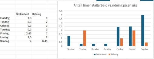
Visualisering av hvor mange timer brukt på stallarbeid i forhold til antall timer til ridning ila en uke.
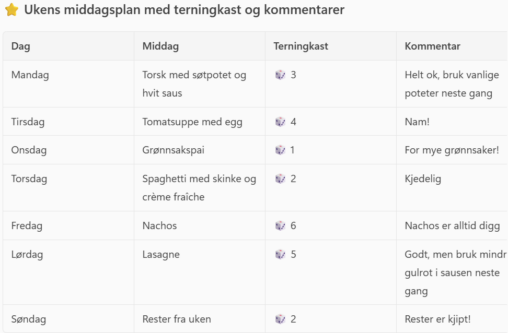
The table shows a typical week of dinners in our family. Over the course of a week, the children in the family have given a dice roll and…
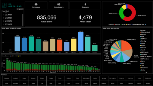
Dette er en visualisering av data over produksjon i kulturarv digitisering gjennom tid. Den gir en oversikt over antall bilder, kilder som er skannet, hvem som er operatør…
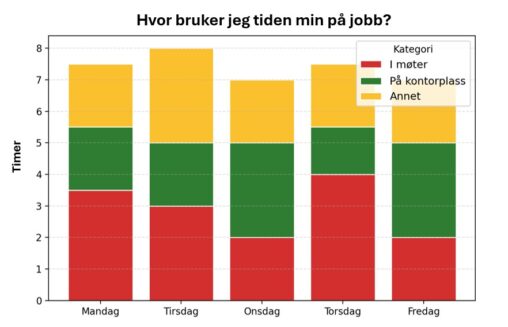
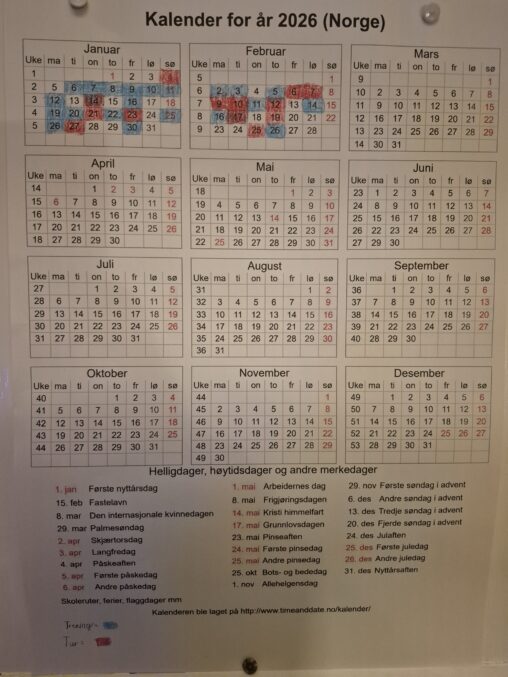
Figuren viser et stablet stolpediagram som illustrerer fordeling av hvordan jeg brukte arbeidstiden min i løpet av én valgt arbeidsuke (uke 7) i 2026. Den horisontale aksen viser…
Visualization of transport method used based on the activity detection feature in Google Maps Timeline. Distance is in km and time is in minutes.
Oversikt over trening og tur aktivitet i 2026. Rød markering betyr at det er gått tur. Blå markering betyr at det er utført en treningsøkt. Visningen sier ikke…
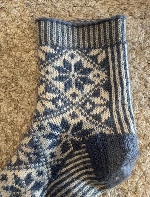
Bilde av strikkemønster. Hver maske er et datapunkt, og bildet skal vise fasong, mønster og skal gi kontekst til visualiseringen.
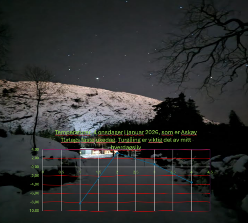
Bilde tatt selv. Temperaturer avlest direkte selv og logget. Selv eier av all data
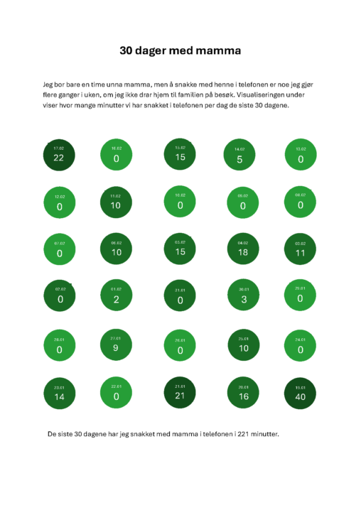
Jeg har brukt telefonloggen for å se hvor mange minutter jeg har snakket i telefon med mamma over en 30 dagers periode. Perioden er fra 19.01 til 17.02…
Jeg har en travel uke som består av reising med buss, venting og undervisning. Jeg har prøvd å vise hvor mange time bruker jeg på forskjellige ting. Jeg…
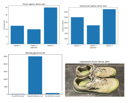
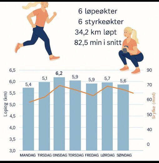
I denne datavisualiseringen, har jeg, ved hjelp av ChatGPT til å lage grafer for mine data, visualisert de tilgjengelige data for mine løpeturer denne uken. Dette inkluderer hvor…
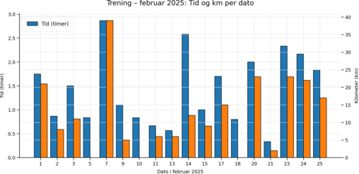
Jeg har registrert trening for dagene i februar og talt antall km og tid de dager jeg har trent. Dette er satt opp i en tabell og senere…

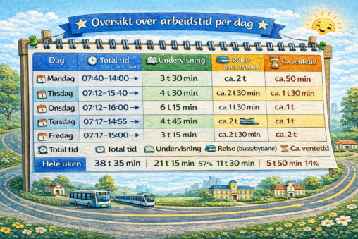
Jeg har en travel hverdag. Jeg reiser på forskjellige skoler i løpet av dagen og uken. Min hverdag består av reising, undervisning og venting på buss. Jeg har…

Jeg har en travel hverdag. Jeg reiser i løpet av dagen og uken til forskjellige skoler. Arbeidsuken min består av reising med buss, undervisning og venting på buss….
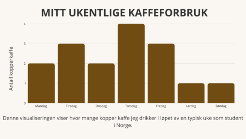
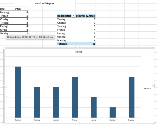
Denne visualiseringen viser antall kopper kaffe jeg drikker per dag i løpet av en typisk uke som student i Norge. Dataene er samlet inn manuelt og representerer mitt…
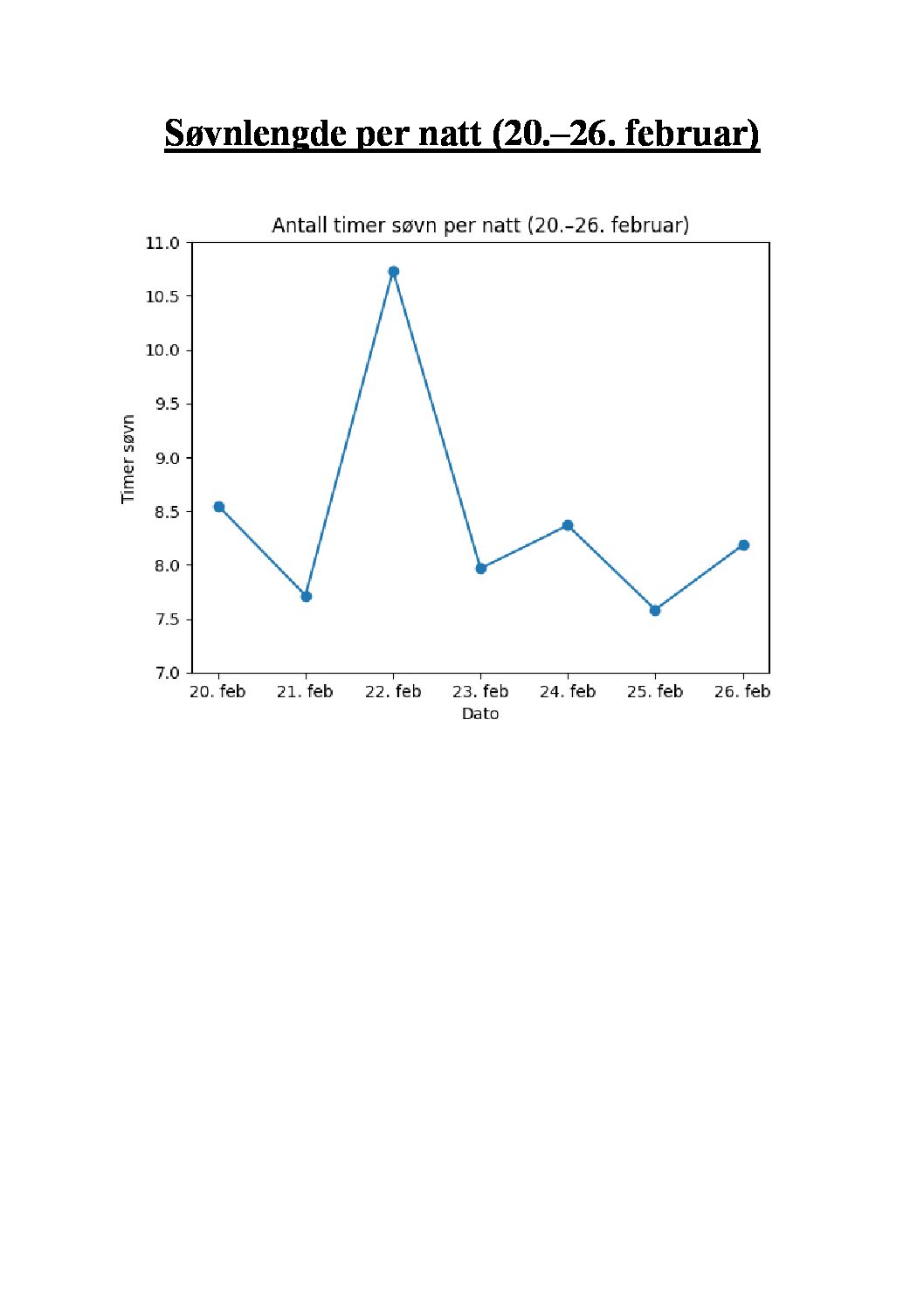
Visualiseringen viser en oversikt over egen søvnlengde i timer per natt i perioden 20-26 februar 2026.