1463 Data visualizations Categorized "30-64" (page 17 of 74)
The drawing visualizes the dates for training outdoors with my neighbors in the period September 2025 to January 2026. I started with my Strava app to see when…
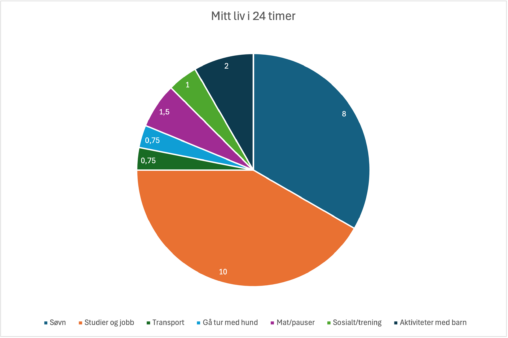
Denne visualiseringen viser hvordan en vanlig hverdag i mitt liv kan representeres gjennom data, fordelt over et døgn på 24 timer. Diagrammet er basert på egen estimering av…
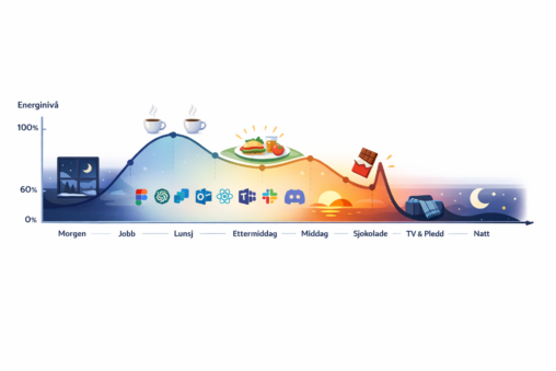
This is a conceptual, slightly humorous data visualization that uses a time-based energy curve and visual markers to communicate patterns and perceived flow, rather than precise measurement. Made…
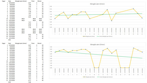
Data collection: table with sleep record for 21 days Data preparation: nights not wearing watch provided 0 hrs and minutes which in return showed false trendline, avg. (average)…
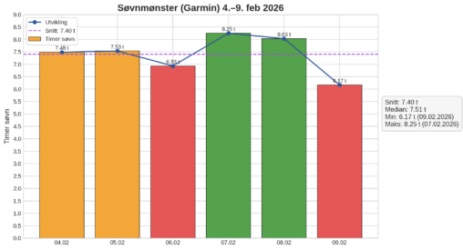
Data er hentet fra Garmin treningsklokke, deretter lagt inn i Excel (tabell). Jeg har så brukt CoPilot til å visualisere dataene i tabellen. KI har også utarbeidet statistiske…
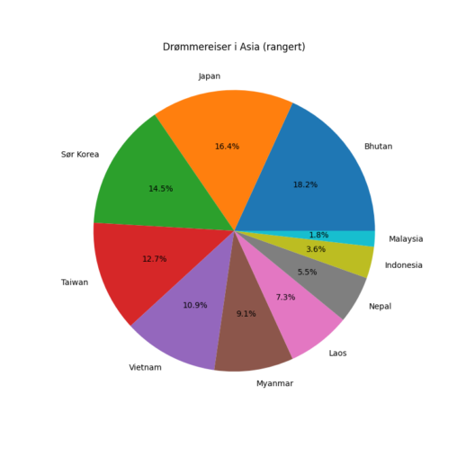
Personlig rangering over de 10 landene jeg kan tenke meg å besøke i Asia. Høyest ønske fikk verdien 10 og lavest ønske en verdi på 1. Verdiene ble…
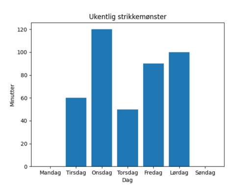
Digital fremvisning i form av stolpediagram som viser antall minutter strikketid i løpet av en uke, gjort av meg. X- akse: Ukedager, Y-akse: Antall minutter brukt på strikking.
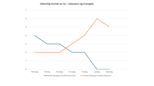
Oversikt over ukentlig inntak av te med antall tekopper og sted. Eier av data er Camilla Andal.
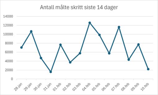
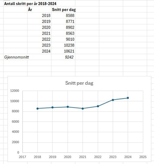
En visuell framstilling av antall målte skritt jeg har tatt de siste 14 dagene.
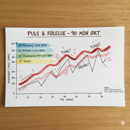
Strava viser ofte bare watt, fart og puls. Men hva med følelsen? Jeg har hentet ut pulsdata fra min siste økt, men kombinert det med opplevd anstrengelse. Den…
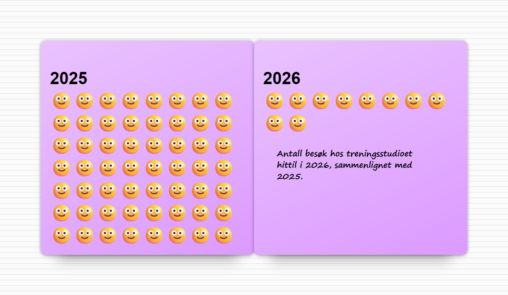
Smileys represent number of gym workouts so far in 2026, compared to 2025.
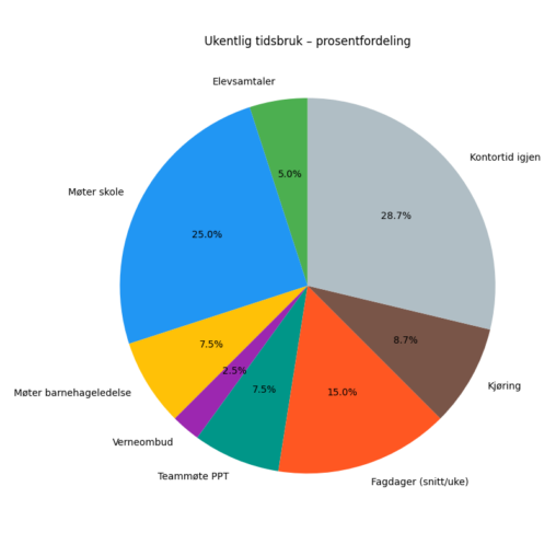
data er hentet ut fra min jobb kalender med avtaler og min kjøredagbok. Jeg har lagt dette inn i ki og “jobbet fram” et kakediagram som skal vise…
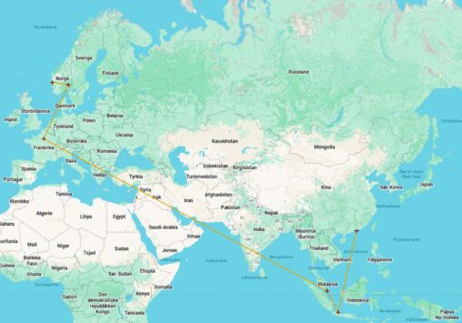
Kart som viser en reiserute med stjerner for flyplasser og linjer som representerer flyreiser
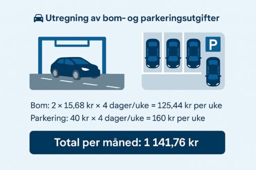
CoPilot har laget denne visualiseringen for meg. Den viser hvordan min bilbruk blir registrert med bompenger til og fra jobb, samt gjennom parkering på mobilapp og hvor mye…
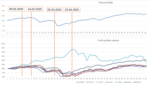
Representasjon av en prosentvis utvikling av en aksje- og fonds-portefølje gjennom de første 9 måneder av 2025 som godt visualiserer markante drivere for bevegelsens i markedet. Øverste graf…
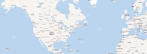
A simple map showing the location of people ordering my childrens book. Based on the postal code, a reverse geocode lookup and QGIS, I can present a world…
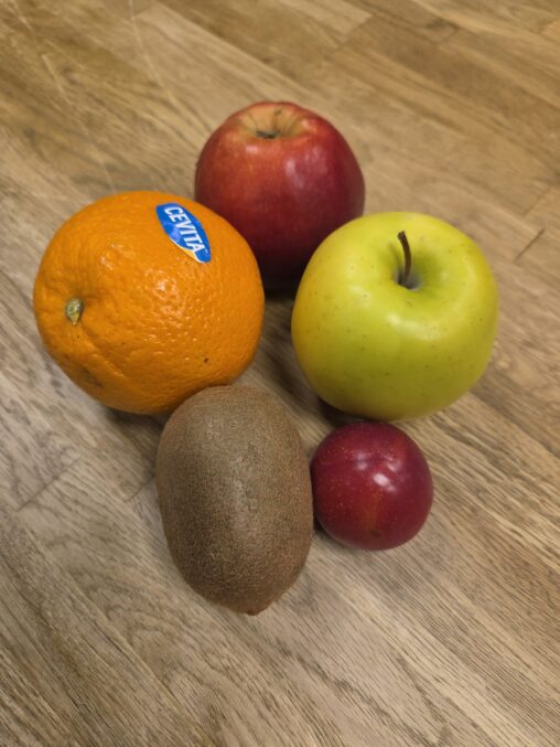
Data viser hvor mange frukt og grønnsaker en person spiser hver dag i løpet av en uke.