
1473 Data visualizations Categorized "30-64" (page 1 of 74)
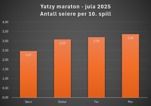
Dette er visualisering av familiens Yatzy-maraton jula 2025. Diagrammet viser antall seire per 10. gjennomførte spill. Antall spillere: 4 stk. Gjennomsnittlig antall spill: 109,25 Visualisert antall seire per…
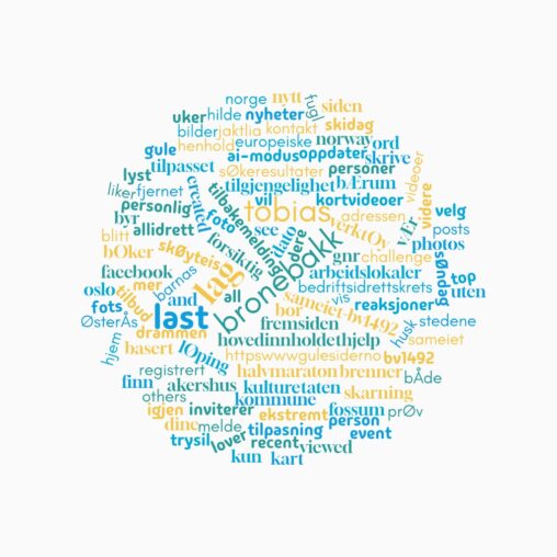
Denne visualiseringen viser ordene som dukker opp når man søker etter navnet mitt på internett. Ordskyen representerer hvordan identiteten min blir konstruert gjennom data på nettet. Den illustrerer…

Dette gjelder visualisering av antall middager meg og min samboer har laget hver så langt i Q1, 2026
This visualization represents the historical price performance of the Cardano ESG Transition Equity Europe fund (ticker: AVEA, ISIN: NL0010579074), listed on Euronext Amsterdam and managed by Cardano Asset…
The visualization illustrates how everyday activities generate data about our lives. Even simple routines like work, exercise or walking the dog can be quantified and represented as data.
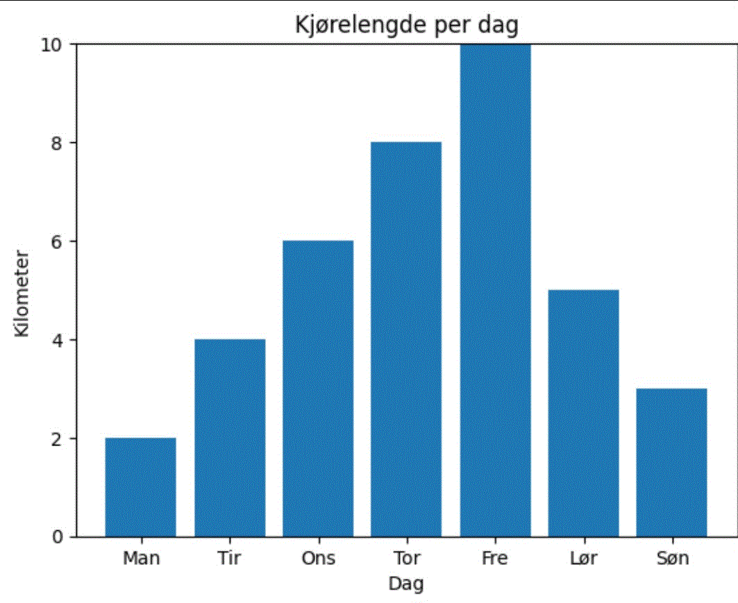
Antall kilometer kjørt gjennom uke 10, fra mandag 2.–søndag 8. mars 2026. Verktøy: Microsoft Excel, egen data.
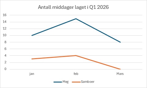
The visualization displays the amount of times me and my partner have made dinner in our household in the months of january, february and march.
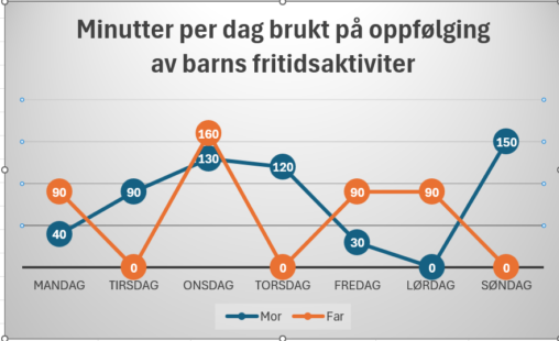
Minutes per day, follow up childrens daily activities
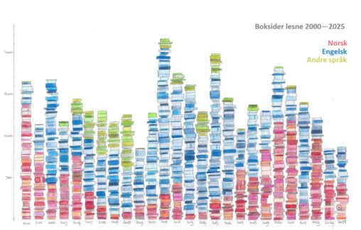
Tal på boksider eg har lese kvart år frå 2000 til 2025 i søylediagram. Tala er henta frå boklista mi. Fargane representerer kva språk sidene var skrivne på.
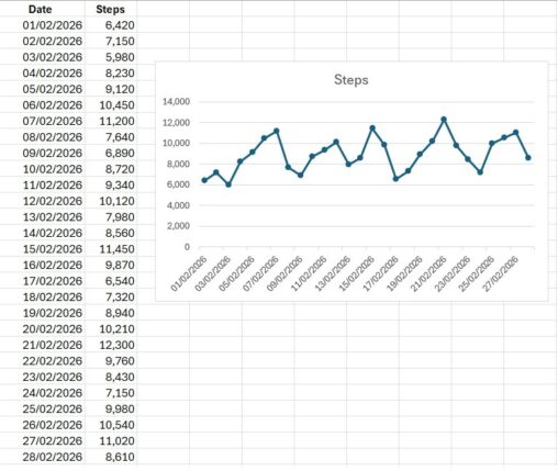
Denne datavisualiseringen viser antall skritt jeg gikk hver dag i løpet av februar 2026. Dataene er målt i antall skritt per dag og representerer daglig fysisk aktivitet over…

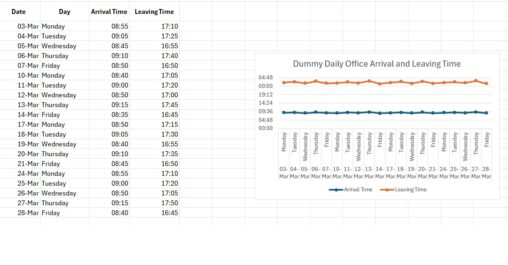
The purpose of this visualization is to illustrate patterns in a normal working routine across one month. Each data point represents a single workday, allowing comparison between arrival…
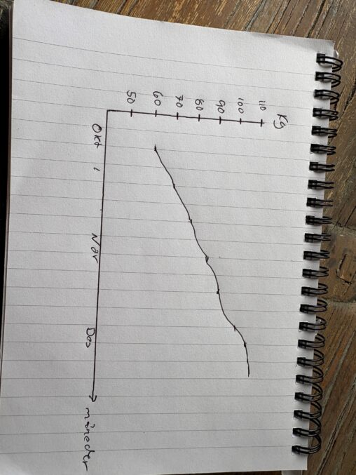
Dette er min vei til å nå over 100KG i benkpress. Startet med å teste på 60kg, men kom ganske raskt opp til 100kg på rundt 3 måneder…
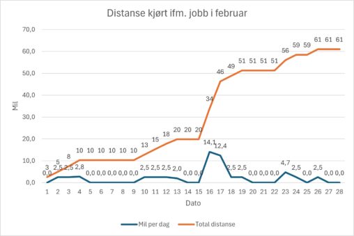
The data visualization show the distance I travelled by car for work-related duties during February. The graph shows distance per day as well as accumulated distance through the…
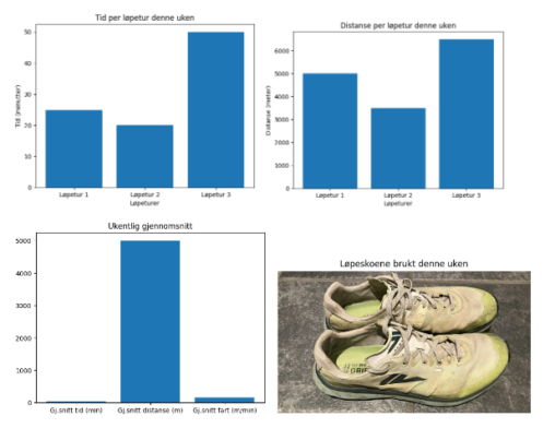
I denne visualiseringen presenterer jeg mine løpeturer for denne uken, hvor lang tid jeg brukte på hver av dem og distansene jeg løp på hver tur, samt gjennomsnitts…
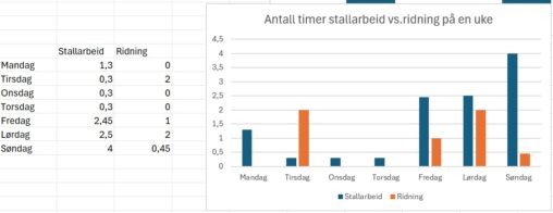
Visualisering av hvor mange timer brukt på stallarbeid i forhold til antall timer til ridning ila en uke.
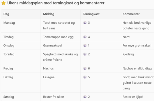
The table shows a typical week of dinners in our family. Over the course of a week, the children in the family have given a dice roll and…
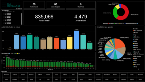
Dette er en visualisering av data over produksjon i kulturarv digitisering gjennom tid. Den gir en oversikt over antall bilder, kilder som er skannet, hvem som er operatør…
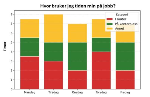
Figuren viser et stablet stolpediagram som illustrerer fordeling av hvordan jeg brukte arbeidstiden min i løpet av én valgt arbeidsuke (uke 7) i 2026. Den horisontale aksen viser…