
1155 Data visualizations Categorized "18-29" (page 9 of 58)
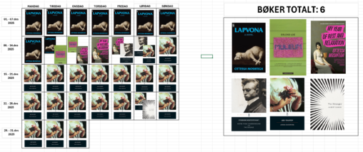
Bøkene jeg selv har lest i desember visualisert i kalenderen. Dagene hvor en bok ble fullført og en ny startet viser to bøker på samme dag. Bilder tatt…
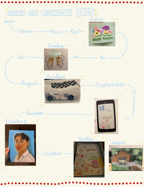
Summary of drawings drawn by me the year of 2025, shown with purpose of drawing and what month it was made.
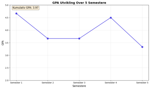
Grafen ble laget i python med Jupiter notebook. For hvert semester la jeg inn gjennomsnitts karrakteren jeg fikk det semestere. Y-aksen er snittkarakter der 5= A, 4=B ,…
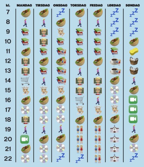
Bildet er en fremstilling av min ukesplan gjennom emojier. Planen inkluderer søvn (zzz), måltider (taco), praktiske eller rekreasjonelle gåturer (person som går), lesing (bøker), forelesning (lærer), matvarehandel (handlekurv),…
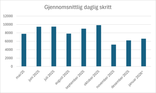
Stolediagram som visualisererer mitt gjennomsnittlige antall daglige skritt (gåing, løping, tur, osv.) per måned fra mai 2025 til januar 2026. Dataene eies av meg og er egeninnsamlet fra…
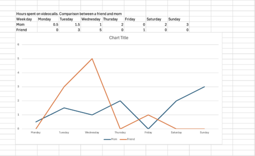
The graph represents a comparison of hours spent on video calls with my mom and my close friend. The data used was personal and taken from WhatsApp and…
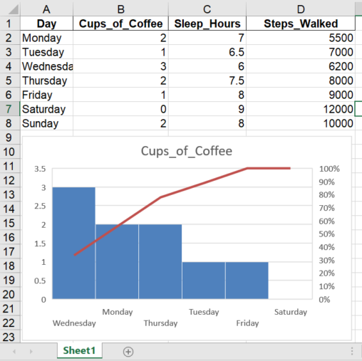
This visualization shows how many cups of coffee I drank each day during one week. The data was self-recorded as part of a personal daily routine tracking exercise….
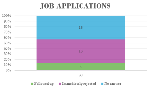
This is a diagram of my job applications I did for my autumn internships. I’ve completed 30 applications, of which I heard back from only 4, and 26…
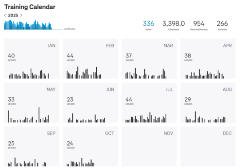
The data shows my training stats for 2025, describing total hours per month, total kilometers and personal records.
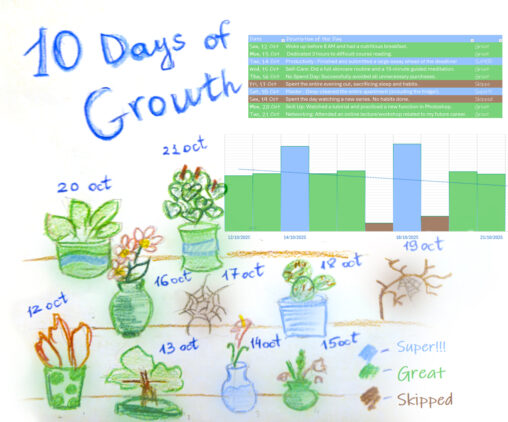
This is my personal habit tracker for 10 days – from October 12 to October 21, 2025. I visualized my progress through the metaphor of growing plants because…
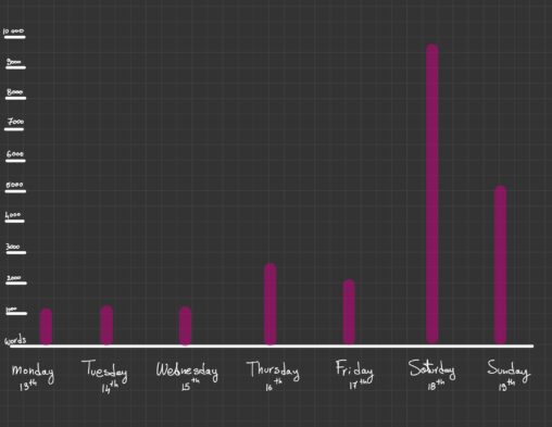
I chose to visualize my daily writing habits over the course of one week, from October 13th to October 19th.
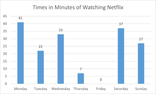
The amount of time spent watching Netflix conducted for one week, starting on the 13th of October 2025, copyright: Microsoft Excel
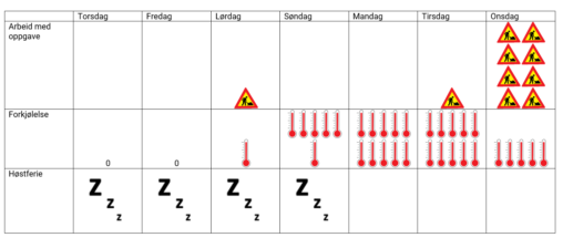
Picture describing 7 day flow containing work, a cold and a holiday. Data visualized by pasting own paintdrawings in to word.
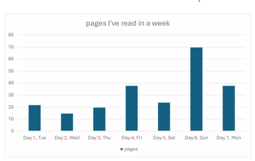
This image shows a diagram of the number of pages I’ve read each day for a week from the current book I am reading.
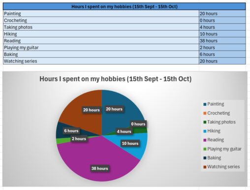
In this picture I represented how much time I spent on my hobbies for 1 month, between the 15th of September and the 15th of October.
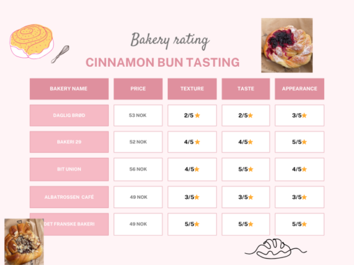
This is a rating of Cinnamon Buns in 5 of Bergens Bakeries. The image is created with Canva.com
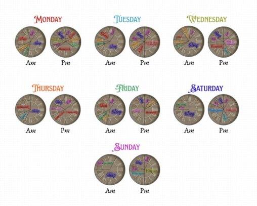
This is my routine in a week. I represented it through the clock in my parents’ living room that I took a picture of and then I separated…
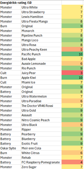
Vurdering av energidrikker på en skala fra 1 (verst) til 10 (best) basert bare på smak. Har brukt betinget formatering i Excel for å gi en fargeskala fra…
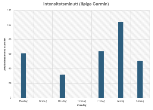
Viser hvor mange intensitetsminutter eg hadde kvar dag i veke 39. Data er samla inn ved hjelp av pulsklokke, og tala er henta frå appen til Garmin. Visualiseringa…