1155 Data visualizations Categorized "18-29" (page 57 of 58)
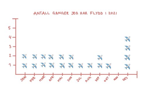
I denne grafen blir det gitt en oversikt over hvor mange flyturer jeg har hatt i løpet av 2021

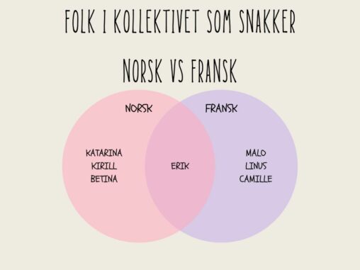
En fremvisning av folk i kollektivet mitt som snakker Norsk, Fransk eller begge språk.
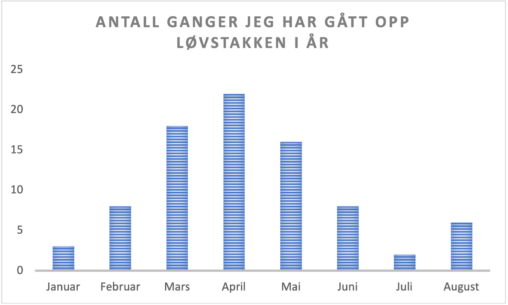
En oversikt over antall ganger jeg har besteget fjellet Løvstakken til nå i år. Grafen viser hvor mange ganger jeg har gått opp hver måned.
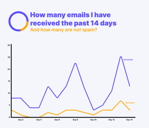
This chart shows the number of emails I received from August 11th-August 24th 2022. I received a total of 153 emails, and 32 of them were not spam….
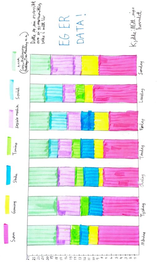
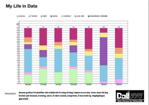
Dette er ein oversikt over ei gjennomsnittleg veke for meg i timar. Kva eg brukar tida mi til og kor mykje tid eg brukar på kvar enkelt.
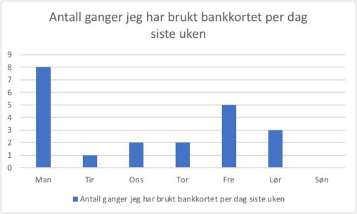
Dataene viser antall ganger jeg brukte bankkortet mitt per dag forrige uke.
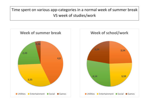
This is two diagrams that show the difference between time spent on various app-categories on my phone in a average week of summerbreak versus a average week of…
En fremstilling av hvor mange timer jeg bruker på ulike aktiviteter i løpet av en uke.
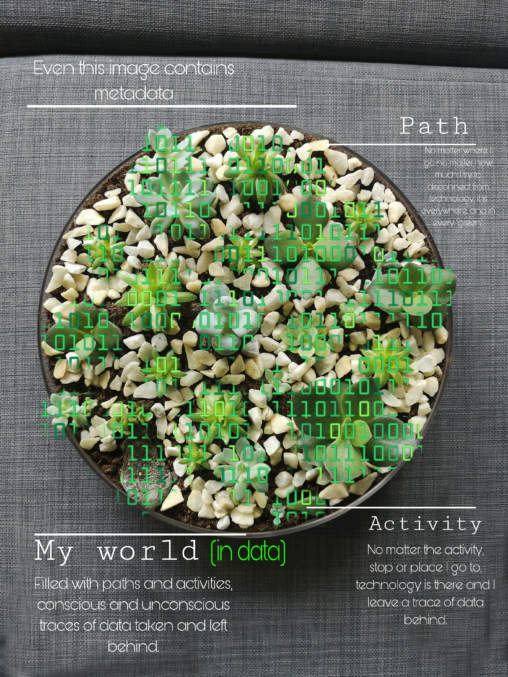
A photographic representation of my world in data. Where my world is the vase, the stones are my paths and succulents are activities or points I pass. The…
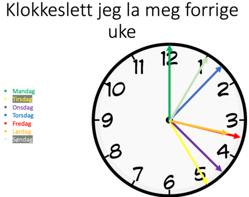
This is my sleep schedule during my previous week. The clock is analogue so that the times may be interpreted subjectively.

The following graph shows the amount of times i have been arrested or detained by police in various countries. The source and owner of the data is myself…

Average rainfall for each month in Sandnes for the years 1985-2015. Data available from timeanddate.com.
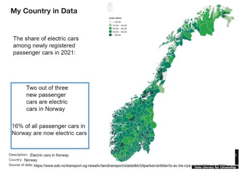
Share of electric cars in Norway among newly registered passenger cars in 2021
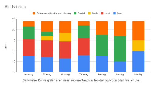
Denne grafen er en visuell representasjon av hvordan jeg fordeler tiden min på sosiale medier og underholdning, søvn, sosiale aktiviteter, skole og arbeid i en gitt uke. Enkelte…
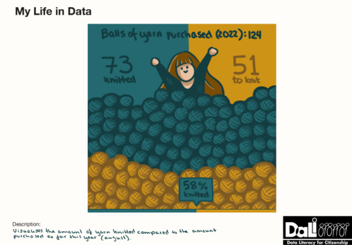
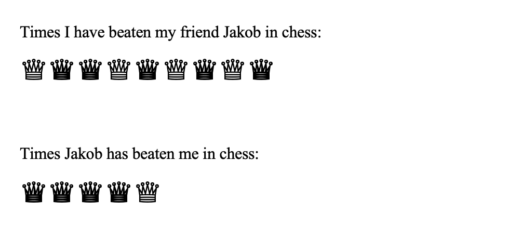
Gives an overview of yarn purchase and usage. 124 balls of yarn has been purchased so far this year (august), and 73 of these has been knitted. This…