
1155 Data visualizations Categorized "18-29" (page 51 of 58)
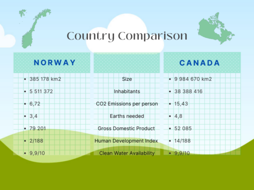
Data represented: Size Inhabitants CO2 Emissions per person Earths needed Gross Domestic Product (GDP) Human Development Index (HDI) Clean Water Availability
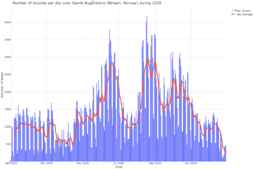
The visualisation is a graph showing the daily number of bicycle crossings in 2020 (early Covid-19) over a measuring point set up by The Norwegian Public Roads Administration…
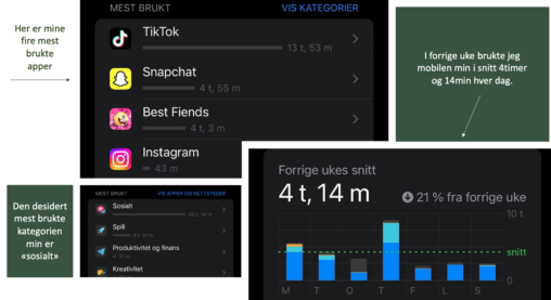
Dette er en visuell representasjon av hva jeg bruker tiden min på når jeg er på mobilen i løpet av en uke. Det inkluderer gjennomsnittstid brukt på mobilen…
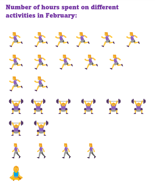
Number of hours spent on different activities in February represented in images. One image = one hour.
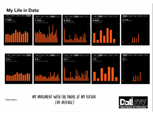
Average steps and distance traveled (by foot) in different intervalls. As it is recorded by iPhone, it means steps and distance traveled with iPhone with me.
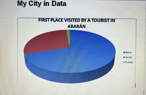
Abarán is one of the lesser known but most historic towns in the region. It has some very prestigious sites, but the most prestigious by far is the…
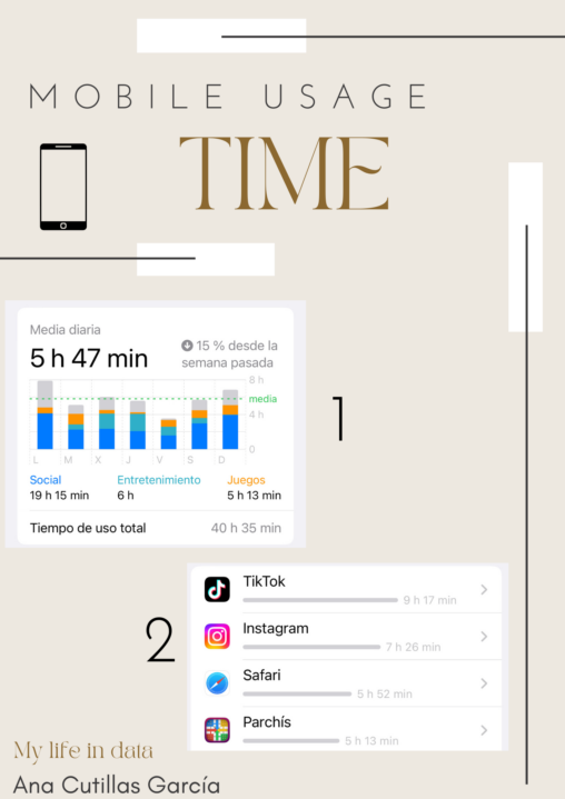
In this picture, I´m presenting the average time I use my mobile in a week. As you can see in picture number 1, the average time is 5h…

I love reading and this past years I have been buying books to add to my bookshelf. Right now the genres that predominate in my bookshelf are fantasy,…

I have always liked changing hair colors. That’s why when I was in my first year of high school I started dyeing it. Since then, I have been…
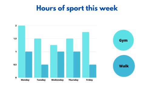
I have decided to do the task about the amount of sport I do in a week. In the graph we can see the hours I dedicate to…
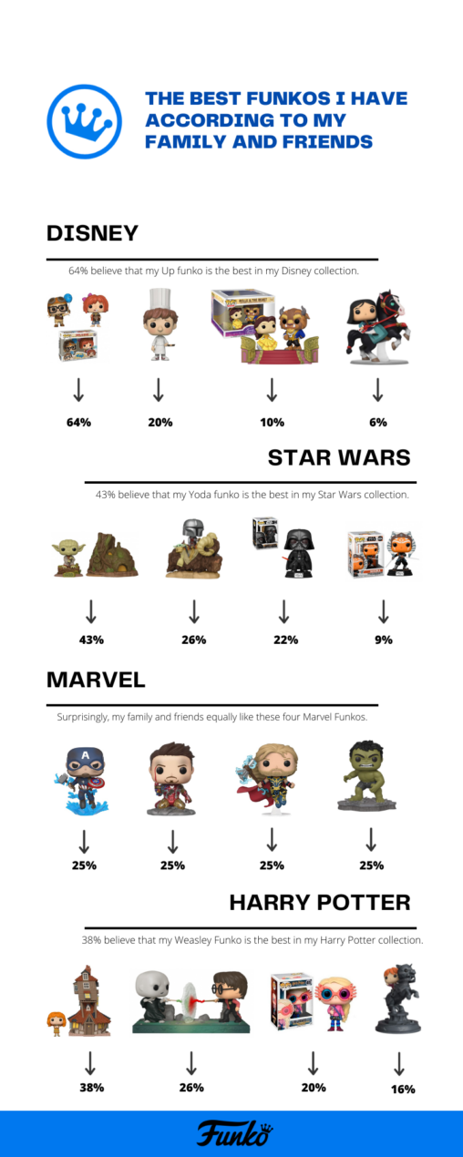
In this data visualization you can see the percentage of people who prefer a Funko or another of my four collections (Disney, Star Wars, Marvel and Harry Potter).

I have decided to collect some information about my day, about the activities I do such as dancing, and the time I spend on each of them expressed…

Personally, food is one of the greatest pleasures in life, which is why it is essential to enjoy this pleasure, to do it in the best places. According…

According to my mobile data, this is the average time that I listen music during a month, actually during January.
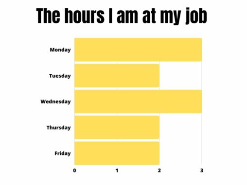
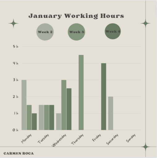
With this simple graphic I wanted to show everyone how many hours I work on the afternnoons every week at job. Also, having to go to the university…
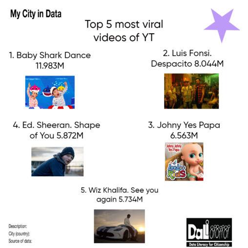
In this list of the most listened songs we have: in first place Baby Shark Dance, in second place Luis Fonsi, in third place Johny Yes Papa, in…
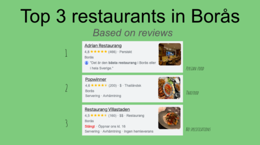
The top 3 best restaurants in Borås, Sweden. Based on the number of stars in Google reviews. Presented with the origin of the food that’s served at the…

On these graphic you can visualize the most preferred places when travelling trough Spain in 2019 and 2020. Public Domain.
I work part-time as a private tutor with children in the afternoons after uni. In order to carry out both, uni and work, I have to be very…

The aim of this graphic is to observe the amount of sleep that a student gets during school time in contrast with the holiday period.