
1155 Data visualizations Categorized "18-29" (page 45 of 58)
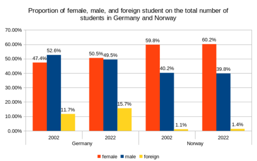
Percentages of female, male, and foreign students relative to the total student population. One fact that rather astonished me was that much more females than males were studying…

This is a representation over my finished knitting project each month from September 2020 until September 2023.
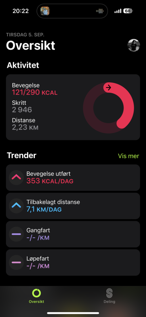
This image contains my activity statistics on the 5th og September, 2023. These numbers have definitely been higher before! Today was not my most productive day in terms…
This bar-chart shows how much homework I have done today.
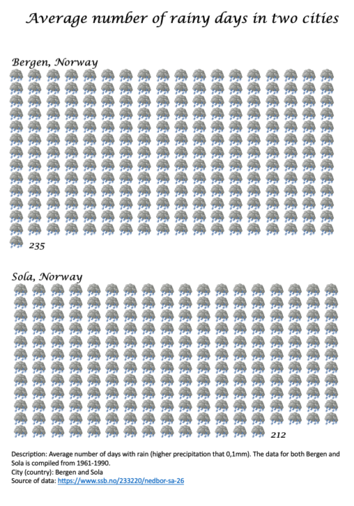
Average number of days with rain (higher precipitation that 0,1mm). The data for both Bergen and Sola is compiled from 1961-1990. Data collected from “https://www.ssb.no/233220/nedbor-sa-26”
This bar-chart shows how much homework I have done today.
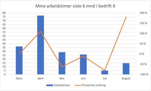
Oversikten viser hvordan mine arbeidstimer er fordelt de siste 6 månedene hos min arbeidsgiver bedrift X. Det er også lagt inn en graf som viser om månedens timeantall…
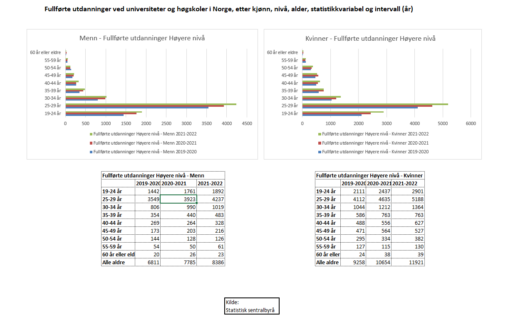
Fullførte utdanninger ved universiteter og høgskoler i Norge, etter kjønn, nivå, alder, statistikkvariabel og intervall fra 2019 til 2022. Inkluderer fullførte grader med en varighet på mer enn…
I am the owner of this data. The data is collected from Apple Health and represented using Google-sheets

text=I have made a diagramme to visualize what a student’s life can contain. As you can see, stress and discipline is a big part of it.
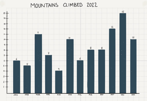
This graph shows how many mountains I climbed each month in 2022, as part of my project to complete 100 hikes in a year.
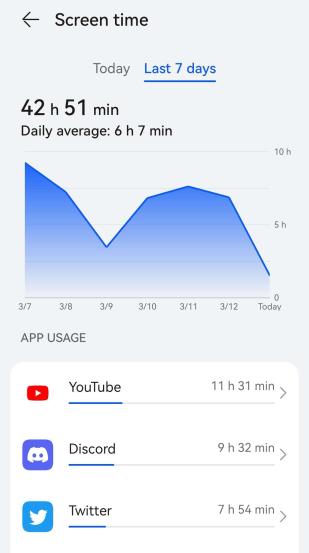
This image shows my screentime from March 7th to March 13th, 2023. The numbers displayed are quite frankly terrifying! I must admit I didn’t know I was this…
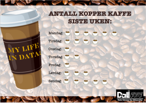
In the image, data from my own life is represented by looking at the number of cups of coffee I have drunk in the last week. This is…
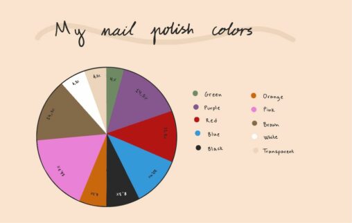
This pie chart shows my nail polish colors by percentage of my total amount of nail polishes.
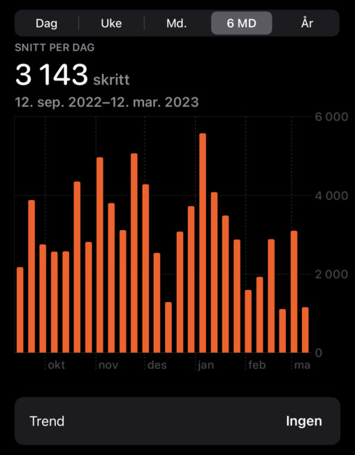
The diagram shows the average number of steps I have taken over the past 6 months. We see in January that more steps were taken than usual. It’s…
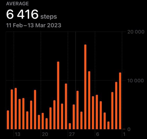
Using the health app on the iphone I am able to track the amount of steps I take each day. The bar chart shows the amount of steps…

Screen time average over a week representented as a bar chart with every individual day represented and how time was spent each day on various types of apps…
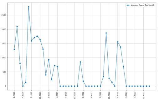
shopping data downloaded from Trumf. Each point represents a month with the Y-axis representing how much I spent in that month. Plotted using python. Funnily, it shows when…

A coarse-grained pie chart depicting a typical day of the week for an anonymous student.
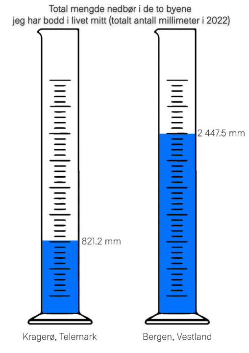
Comparison for the total rainfall in 2022, between the two cities Kragerø and Bergen, the two cities I’ve lived in my life