
1155 Data visualizations Categorized "18-29" (page 43 of 58)
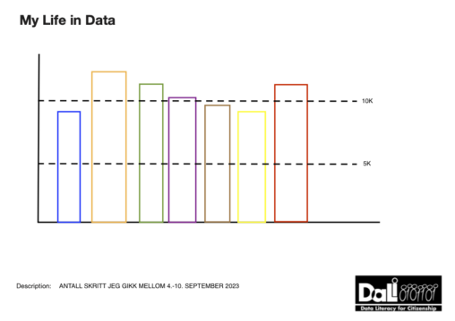
Number of steps that I walked between 4th and 10th September. Measured in km. Public Domain, owner of the data is me.
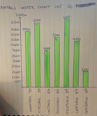
Bildet viser hvor mange meter jeg svømte hver uke i uke 36. Antall meter er hentet fra pulsmåleren min.
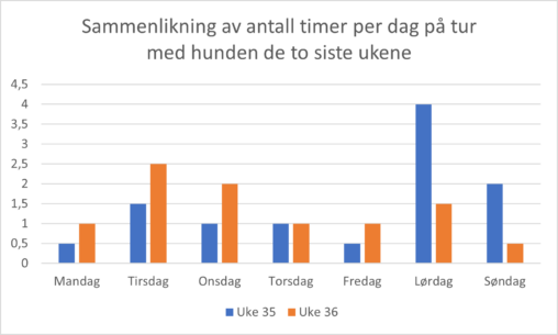
Data samlet inn de to siste ukene om hvor lenge jeg gikk tur med hunden min per dag. Diagrammet viser sammenlikning av ukedagene, der det for eksempel tyder…

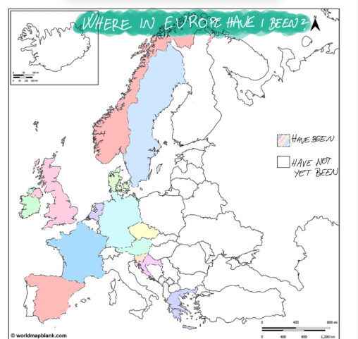
This is a template of an empty Europe map, that I have used to insert data of where in Europe I have visited. The colouring represents where I…
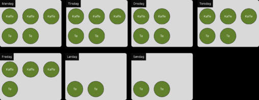
Vises antall kopper kaffe eller Te som blir konsumert i løpet av en uke. Firkanta boksene med ukedag og i boksene er det sirkler enten med tekst “Kaffe”…

Denne tabellen gir en oppsummering av den samlede distansen i kilometer som ble løpt i løpet av året 2022. Inkluderer løping både inne og ute. Publisert: 11/09/23
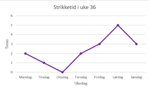
Dette linje-diagrammet viser strikketiden jeg hadde de ulike ukedagene i uke 36.
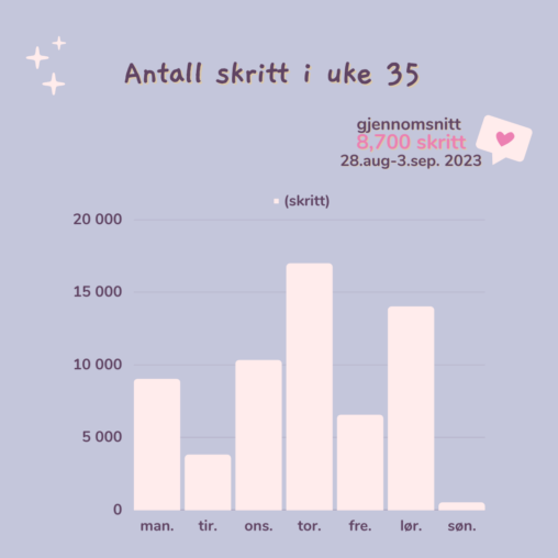
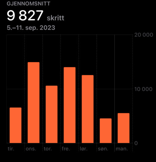
Dette viser en oversikt over hvor mange skritt jeg har gått i uke 35. Informasjonen blir hentet fra Helse-appen fra iPhone.
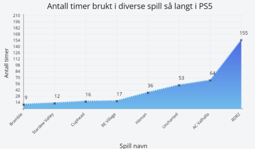
Linjegrafen viser antall timer som jeg har per spill på PS5. Tallene viser antall timer.

Dette diagrammet viser antall timer brukt i hvert spill på min Nintendo Switch. Dataene viser en total spilltid samlet inn fra juli 2021 til dags dato.
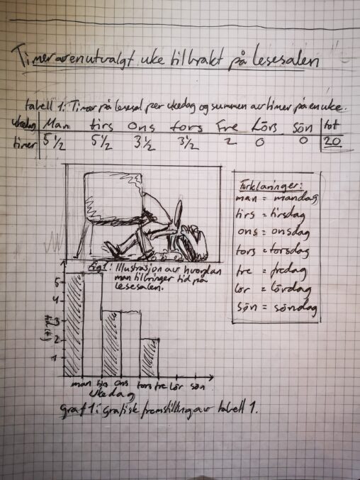
Timer av en utvalgt uke tilbrakt på lesesalen satt opp i tabell, graf og illustrasjon. Dataene og illustrasjonen er mine egne.

Søylene viser antall bøker jeg leste hver måned i årene 2022 og 2023.
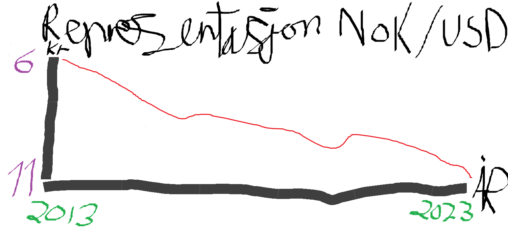
This is a graph representing the exchange range of the valutas NOK/USD from 2013-2023
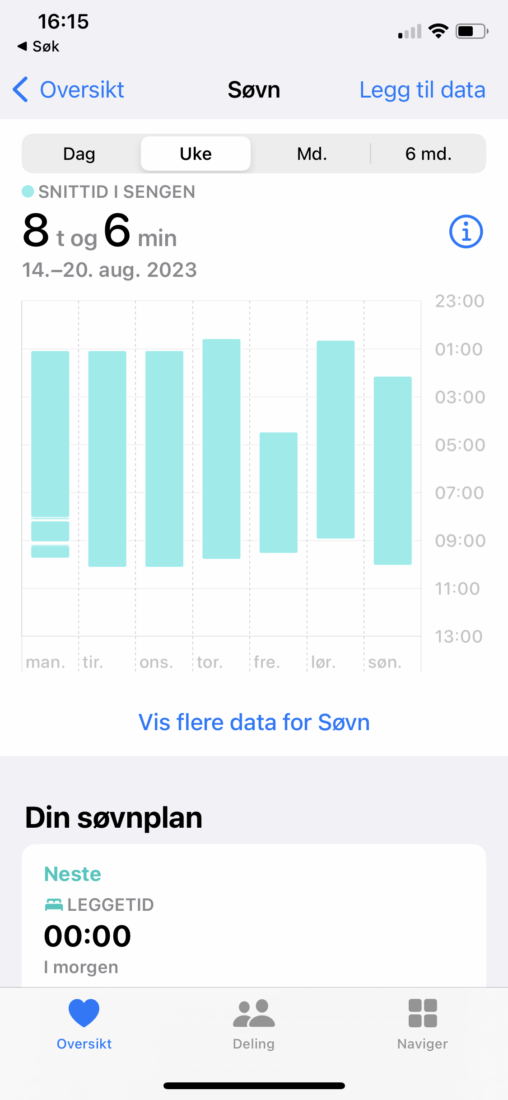
Et skjermbilde av registrert “snittid i sengen” i en tilfeldig uke i august (14.-20. august). Viser antall timer helse-appen på telefonen har registrert at jeg ikke har vært…