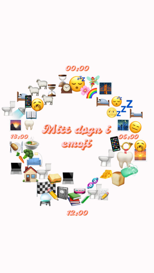
1155 Data visualizations Categorized "18-29" (page 38 of 58)

Here it is shown my all-time favourite music albums following the scheme of an infography becuase I thought that this would be the better way to show my…
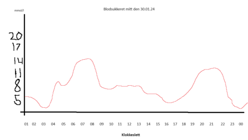
The data represented in this image shows my bloodsugar levels throughout the day 30.01.24
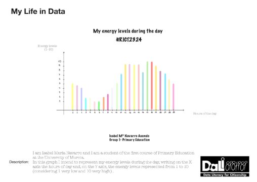
I am Isabel Maria Navarro and I am a student of the first bilingual education course at the University of Murcia. In this graph I intend to represent…
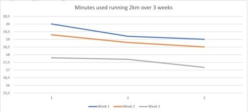
It shows the number of minutes I used running 2 km on the treadmill. This shows the progression in my speed.

The graph above showes hours spent playing competetive valorant per episode/act.

In this graph we can see how many women called Rocio live in Spain and where is this name more usual. #RICT2324

The numbers are representing what an average Norwegian full time student spend on studying each week compared to Norwegian law students.
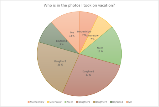
The distribution of photos taken (counted manually): Motherinlaw 62, Sisterinlaw 57, Niece 131, Daughter1 231, Daughter2 195, Boyfriend 76, Me 98
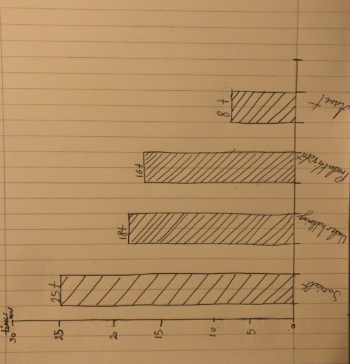
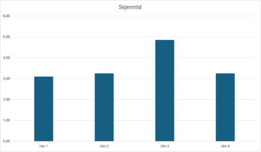
This graph shows how many hours i use on my phone and computer in a week. I put it under different categories like social, entertainment, productivity and other….
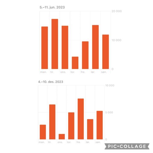
Mine skritt en uke i juni sammenlignet med en uke i desember.
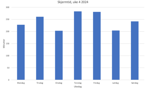
Stolpediagrammet viser hvor mange minutter jeg brukte mobiltelefonen min hver dag i uke 4. X-aksen viser ukedag, og y-aksen viser tid i minutter.
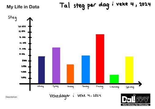
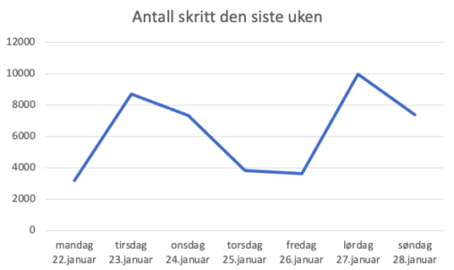
Stolpediagrammet representerer tal steg eg tek per dag i løpet av veke 4, 2024. Eigar av data er meg sjølv og copyright statusen er Public Domain.

Møtte søvnmålet 6/7 dager, bortsett fra 27.januar. Det manglet fem minutter fra åtte timer.
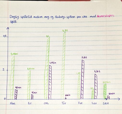
Daglig spilletid av hvor mye tid Galaxy spillere og meg bruker for å spille Homescapes. grafen viser hvor mange timer ble brukt for å spille. der den grønne…
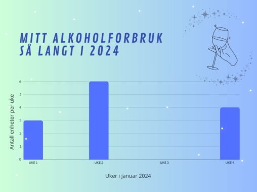
Antall enheter alkohol drukket per uke av en student (meg) de fire første ukene av 2024