1155 Data visualizations Categorized "18-29" (page 3 of 58)
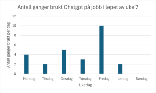
Dataen viser hvor mange ganger jeg har tatt i bruk nettstedet Chatgpt hver arbeidsdag i løpet av en arbeidsuke.
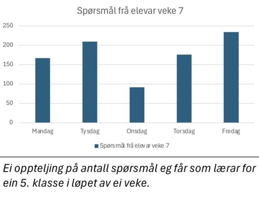
Gjennom veke 7 hadde eg ei registrering på kor mange spørsmål eg fekk av mine elevar i løpet av kvar skuledag.
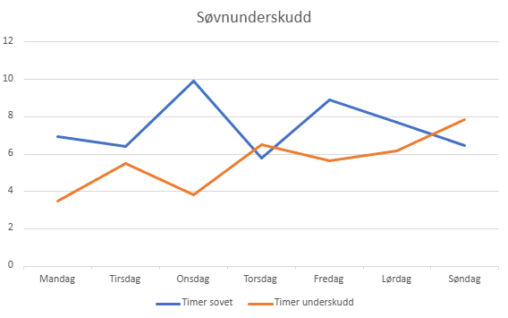
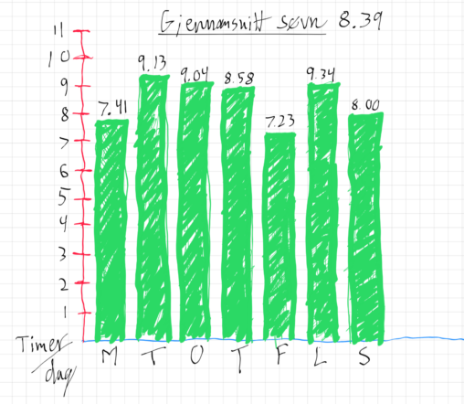
Ringen min sin søvnanalyse, viser at eg har eit søvnbehov på 8t og 30min. Søvnunderskotet mitt blir regulert ut i frå registrert søvn kvar natt.
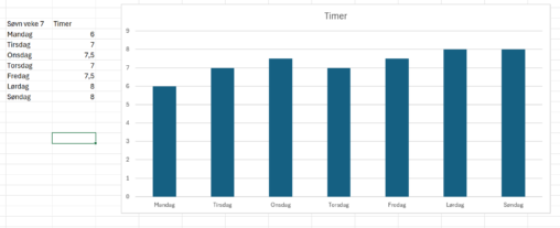
Det er en oversikt over hvor mange timer jeg såv hver natt i uke 7. Dagene er nede på diagrammet. Jeg har delt de inn i hele og…
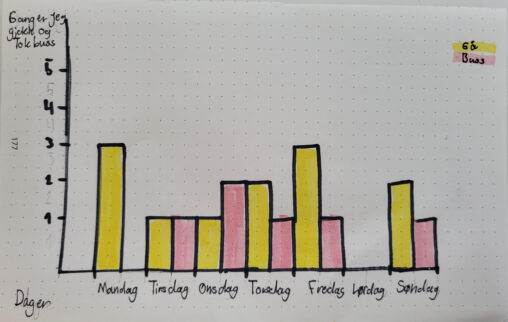
Visualiserer hvor mange ganger jeg gjekk og eller tok buss til og fra hjemme.
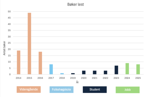
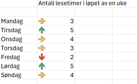
Grafen viser antall bøker lest hvert år de siste 10 årene. Den viser også om jeg var elev, student eller ferdig utdannet.
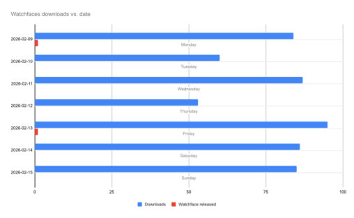
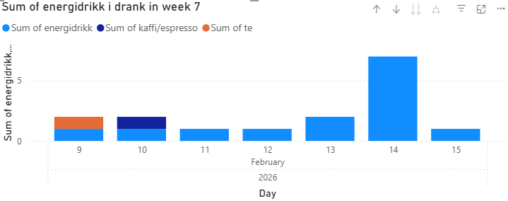
This horizontal bar chart, titled “Watchfaces downloads vs. date”, visualizes daily performance metrics for a one-week period from February 9, 2026, to February 15, 2026. The blue bars…
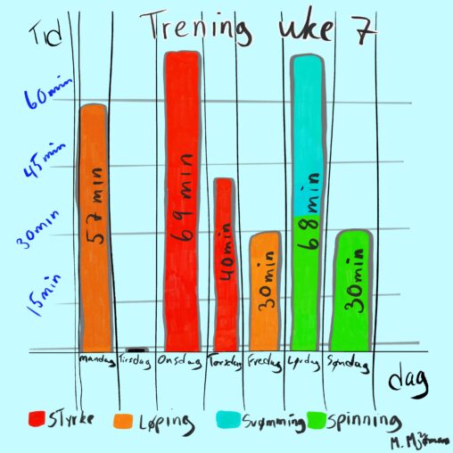
Dette håndtegnede søylediagrammet visualiserer én uke med personlig treningsaktivitet (uke 7), og viser antall minutter brukt på trening hver dag fra mandag til søndag. Y-aksen representerer tid i…
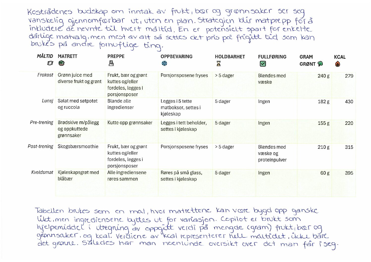
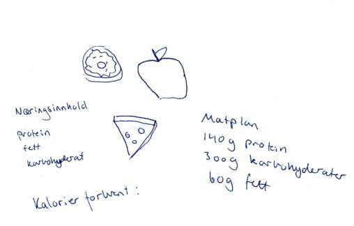
Visualiseringen er laget med bakgrunn i mål om å få i seg rundt 800 gram frukt, bær og grønnsaker hver dag. Dette med opphav i nåværende kostholdsråd, da…
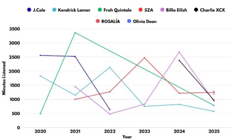
Data from Apple Music’s Replay service allowed me to graph the minutes listed to my favorite artists over the past 5 years.
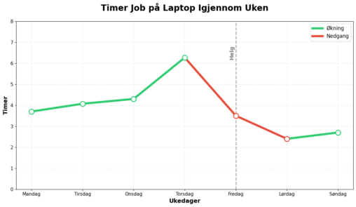
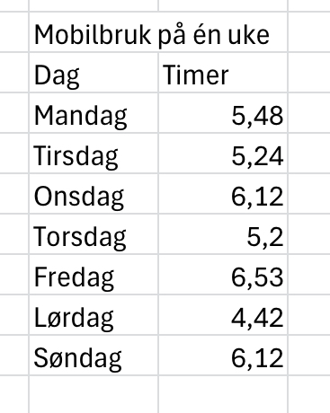
Grafen er en visualisering skjermtiden jeg har hatt på laptopen min den siste uken. Den gir et godt bilde av hvor mye jeg har arbeidet med studier, siden…
Picture shows my sleep last week. Where you see the sleep for each day an the average of that week.

The image represents the types and frequency of questions I receive during a typical school week as a teacher in February 2026. The data visualised are based on…
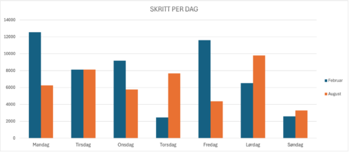
Table illustrating number of steps taken per day, the blue columns representing a week in February and the orange columns representing a week in August. I am the…
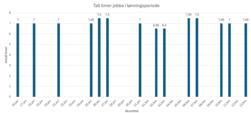
Denne visualiseringen viser antall timer eg har jobbet per dag i ein periode frå 16 .januar til 13 .mars i 2026. Kvar søyle representer antall timer jobbet den…