
1155 Data visualizations Categorized "18-29" (page 18 of 58)
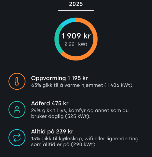
Oversiktlig fordeling av strømforbruk hvor det fordeles mellom oppvarming, atferd og ulike ting som alltid står på i hjemmet.
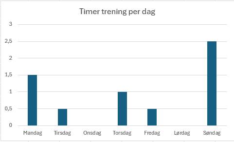
Dataene er hentet fra Iphone sin treningslogg for en tilfeldig uke utvalgt. Viser hvor mange timer trening som er registrert på enheten for en uke.
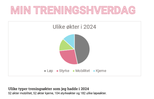
Dette bildet viser de ulike treningsøktene som jeg hadde i 2024 52 økter med mobilitet, 52 økter med kjerne, 104 økter med styrke og 182 økter med løp.
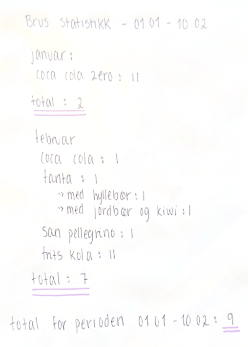
This data provides an overview of types of soda consumed in the time period 01.01-10.02. The data is collected by myself and represent my own consumption pattern.
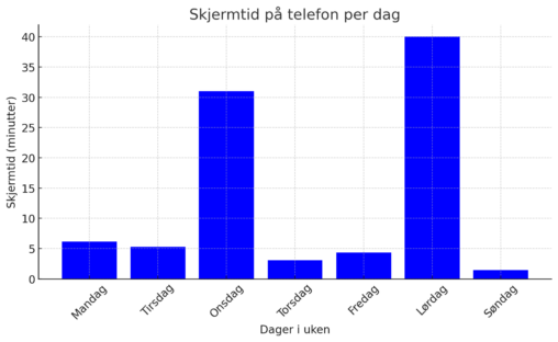
Her er din datavisualisering av skjermtid på telefon per dag 03.02.25-09.02.25 Beskrivelse: “Denne visualiseringen viser min skjermtid på telefon gjennom en uke. Store variasjoner sees spesielt på onsdag…
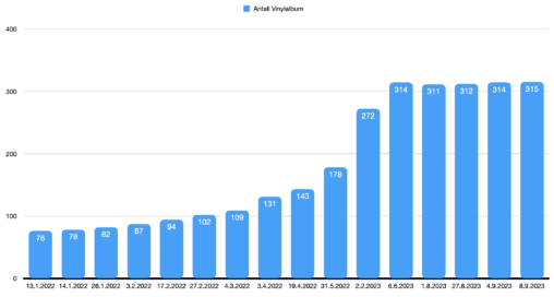
Søylediagram som viser hvor mange album vinylsamlingen min økte med fra Januar 2022 til September 2023 i tilfeldige intervaller.
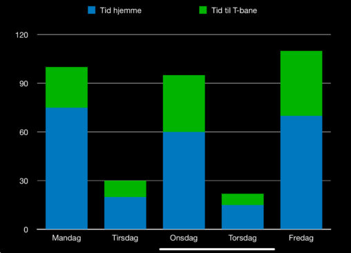
Viser at tid hjemme og tid til T-bane varierte mellom under 30 min til 110 min. Det er public domain. Jeg eier dataen.
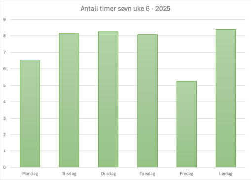
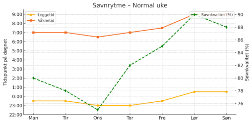
En enkel oversikt over antall timer søvn jeg har hatt i uke 6 i 2025. Diagrammet tar ikke for seg hvor god eller dårlig søvnen er – heller…
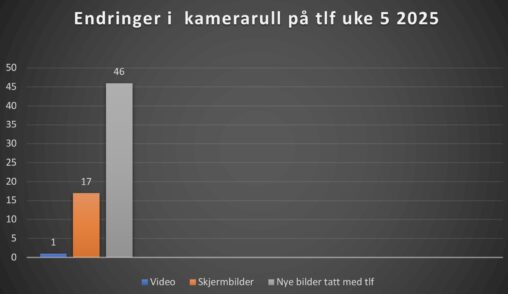
Dette er endringer av innhold i min app “Bilder” på telefonen i løpet av uke 5. Statistikken viser kun nytt innhold fordi ingenting ble sletta den uken.
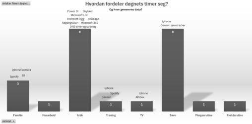
The hours of a regular day and how they are filled with different activities, with examples of where data is generated throughout daily activities.
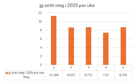
A chart showing the average amount of steps I’ve taken each week in 2025. The y-axis shows steps while the x-axis shows the weeks. Below you will find…
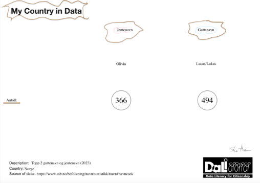
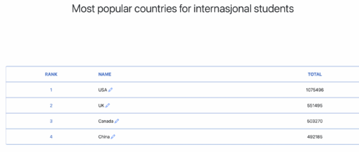
Kjært barn har mange navn! Navnetrender endrer seg fra tiår til tiår, men noen navn holder seg stabilt populære. I 2023 tronet Lucas/Lukas og Olivia øverst på listen…
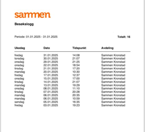
Viser antall ganger jeg kom meg på treningsenteret i januar 2025. Det inkluderer dato, tidspunkt og ukedag for hvert besøk.
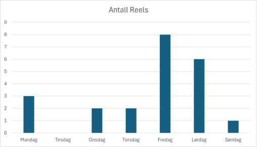
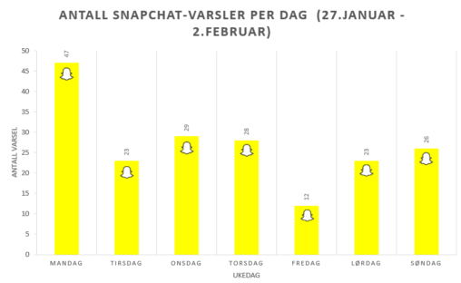
Antall Reels min samboer har delt med meg på Instagram den siste uken fra 27 januar til og med 2 februar
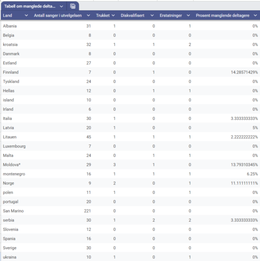
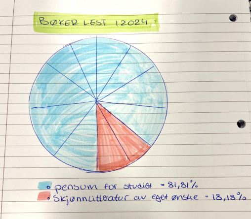
Dette er en tabell som viser antall sanger, hvor mange som har trukket seg, hvor mange diskvalifiserte, hvor mange sanger ble erstattet av andre og hvor mange prosent…
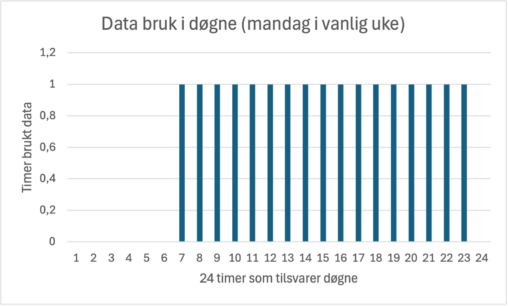
Eg har brukt excel ark til å visualisere min data bruk i eit døgn (24 timer). Grafen i x-aksen er det 24 timer og y-aksen representere timer. PS:…