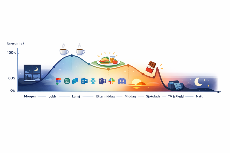
This is a conceptual, slightly humorous data visualization that uses a time-based energy curve and visual markers to communicate patterns and perceived flow, rather than precise measurement.
Made by ChatGPT after my own idea.

A SPLOT on the Web: DALI worlds.
Blame @cogdog for the TRU Collector Theme, based on Fukasawa by Anders Norén.
This is a conceptual, slightly humorous data visualization that uses a time-based energy curve and visual markers to communicate patterns and perceived flow, rather than precise measurement.
Made by ChatGPT after my own idea.