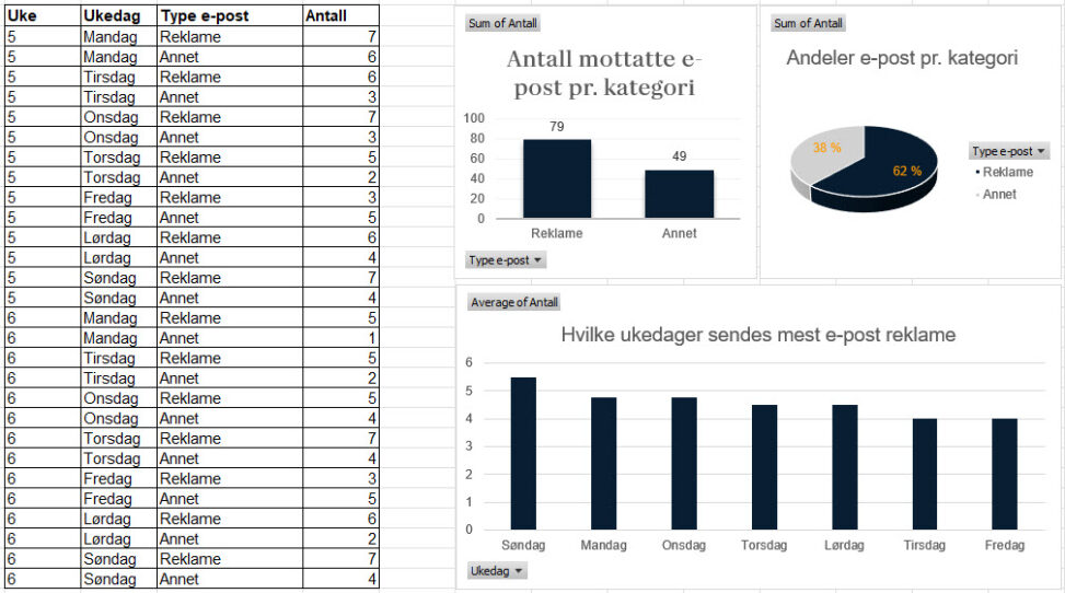
The data table and visualization represents received e-mails in private inbox over two weeks. The data set includes week, weekday and type of e-mail in categories Advertisement and Other.
The three visualizations presents the total number and percentage of e-mails in each category, and also which weekdays I am most prone to receive advertisement by e-mail.
Overall, the data visualizes a result of me being careless with protecting my own data.