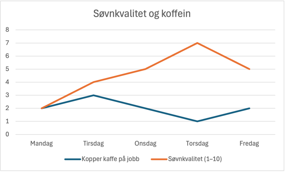
This visualization shows how many cups of coffee I drink during workdays and how I rate my sleep quality on a scale from 1 to 10. The data is collected over one work week and reflects my subjective experience of energy use and rest in everyday life.

A SPLOT on the Web: DALI worlds.
Blame @cogdog for the TRU Collector Theme, based on Fukasawa by Anders Norén.
This visualization shows how many cups of coffee I drink during workdays and how I rate my sleep quality on a scale from 1 to 10. The data is collected over one work week and reflects my subjective experience of energy use and rest in everyday life.