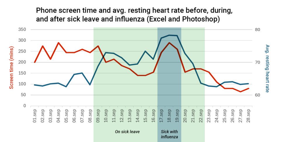
In September 2025, I was on a 14 day sick leave, during which I also fell ill with the flu for three days. When I looked at my resting heart rate and screen time during the two week span, I found it interesting and decided to add it into Excel to visualize it in two separate graphs which I’ve since overlayed on top of each other in Photoshop. The most interesting time periods have also been shaded. Both sets of data were taken from the Health app and Screen Time function on my iPhone 15, with the resting heart rate being measured by my Apple Watch Series 5. The data for screen time is presented in minutes, and the data for average resting heart rate is presented in the average bpm given by the health app.