
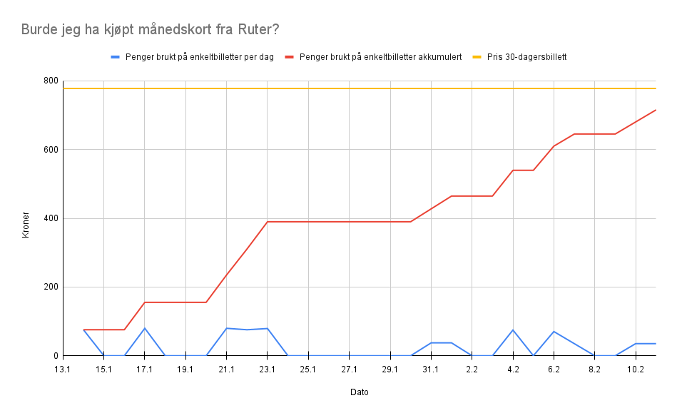
The diagram is showing the amount of money (in kroner) an individual has spent on public transportation over 30 days (Jan 13th to Feb 10th 2025), compared to the price of a 30 day ticket. Money spent is shown both on each date, as well as accumulated.
The data source is my own purchase historic in the app for the public transportation provider, Ruter.
Copyright status: Public Domain