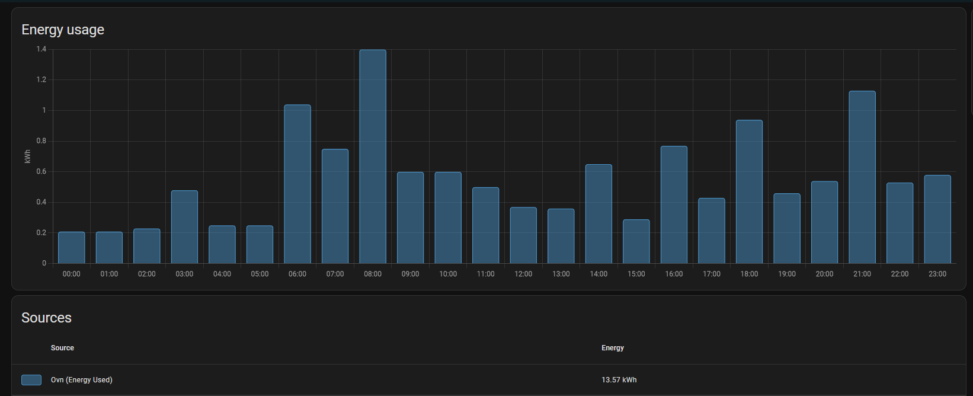
This image shows a bar graph where each bar represents 1 hour of time, and the value that the graph is showing is how much kWh my oven used each hour yesterday. Below the graph, you can see the total amount of kWh that the oven used for the entire day.
Shared By: Anonymous
Source: I got the data & graph from my Home Assistant server. Where my oven is sending data of how much watt it's using to Home Assistant, and then home assistant logs the data & displays it in the graph shown in the image.
Image Alt Text: Hourly energy used by my oven yesterday