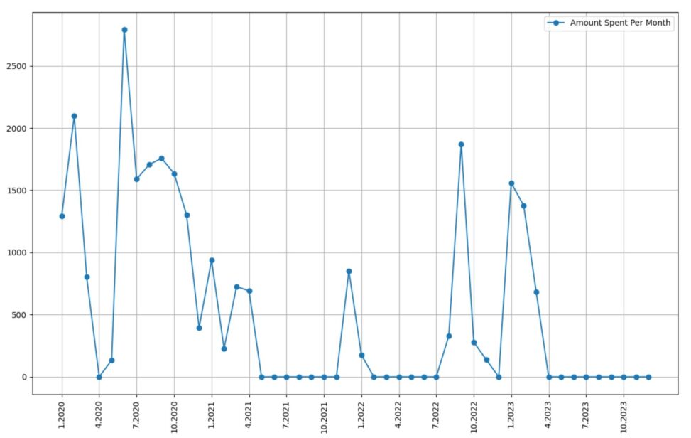
shopping data downloaded from Trumf. Each point represents a month with the Y-axis representing how much I spent in that month. Plotted using python.
Funnily, it shows when I moved back home during the beginning of covid as well as my time abroad (when I wasn’t shopping in norway).


