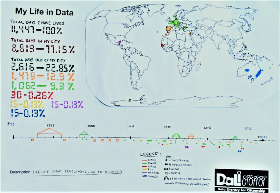
These sets of data represent different aspects about the time and places out of my city (in Spain or abroad) where I travelled to or lived in.
Thre are three sets of data:
1. Numbers showing the total amount of days I have spent living in or travelling abroad/ out of my city (in Spain).
2. World map showing the countries or areas where I have travelled to/ lived in.
3. Timeline showing the time spent abroad/ out of my city (in Spain).
How to read the data:
– For the three sets of data:
Colours (representing places – Spain and continents):
Orange: Spain
Green: Europe
Red: Africa
Yellow: Asia
Purple: America
Blue: Oceania
– For the timeline set of data:
Symbols (representing time):
Dot: one week
Two dots: two weeks
Three dots: three weeks
Square: one month
House: more than three months
– Date for reading the data (number of days I have lived): 25/01/2022
– Creative Commons Licence: CC BY-NC-ND


