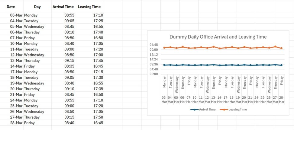
The purpose of this visualization is to illustrate patterns in a normal working routine across one month. Each data point represents a single workday, allowing comparison between arrival times and leaving times throughout the month. The visualization highlights how daily work schedules may vary slightly even within a relatively consistent routine.