
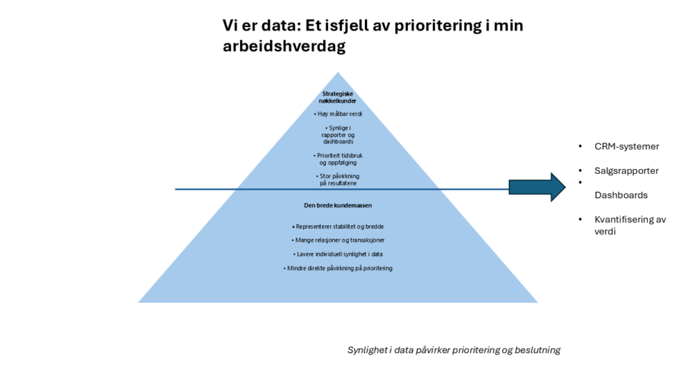
This visualization illustrates how sales data structures my professional practice as a sales manager in TESS. Inspired by the 80/20 principle, the iceberg metaphor represents how a small share of customers generates most measurable value, while a larger customer base contributes stability and breadth.
The visible top of the iceberg symbolizes what is most prominent in reports, dashboards, and CRM systems, and therefore receives strategic attention and prioritized time. Beneath the surface lies a broader network of relationships that are less individually visible in quantitative metrics.
The visualization reflects on datafication: how complex professional relationships are translated into measurable units that shape decision-making, prioritization, and perception of value. In this way, data does not only describe my work – it actively structures it.